Project 2 min read
Alex Eagles Recruitment Campaign
Visual identity and campaign design for a university aerospace recruitment drive.
Overview #
The Alex Eagles recruitment campaign was developed for a student aeronautical team that lacked a consistent visual identity. The campaign needed to introduce a new autonomous and computer-vision subteam, communicate recruitment clearly, and remain recognizable across a series of social posts on the team’s Facebook page. Rather than treating each post as an isolated graphic, the campaign was designed as a single visual system connecting teaser posts, member calls, subteam explainers, recruitment updates, and sponsor announcements into one coherent narrative.
Visual Direction #
Conceptual Framework #
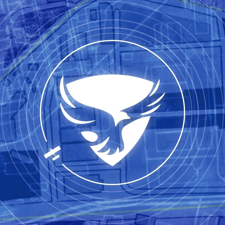
The central metaphor of the campaign was radar. The new subteam focused on computer vision, target detection, cameras, radar, and geolocation, so the visual language expanded the existing team logo into a sensing system with concentric rings, scanning beams, and offset circles suggesting active detection and expanding capability.
Campaign Structure #
Teaser #
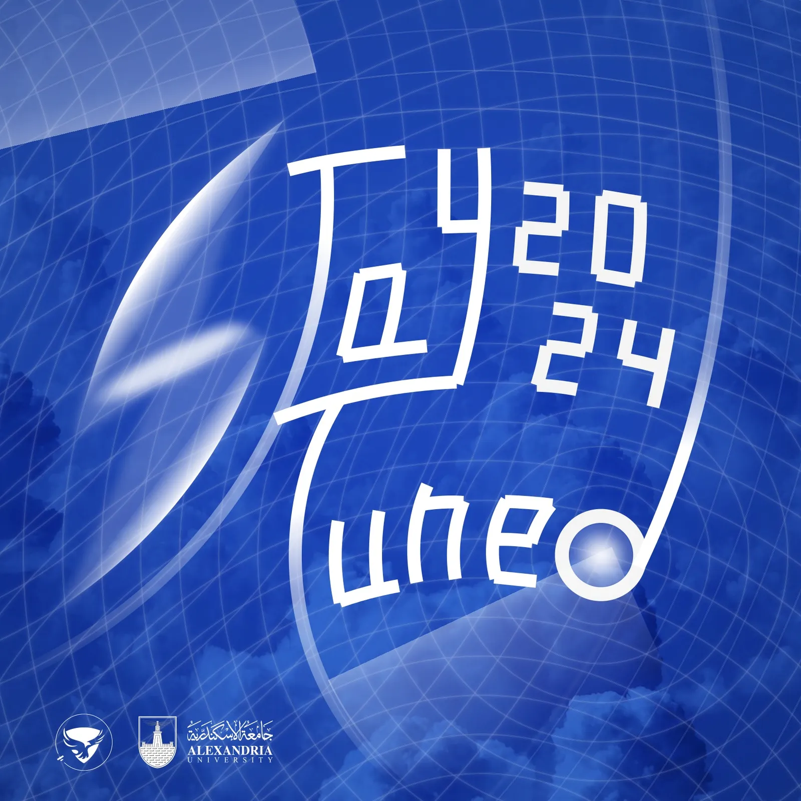
The teaser post introduced the campaign through a phrase built from intersecting radar circles. The letters were constructed from geometry rather than a standard font, reinforcing the idea that the campaign was being “drawn” by the sensing system itself.
Main Recruitment Cover #
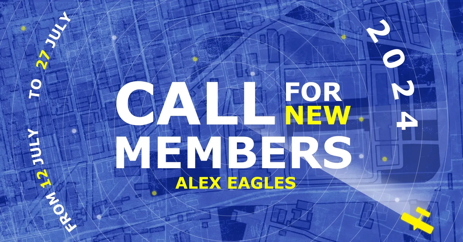
The main recruitment visual extended the team logo into a radar-based composition. Concentric waves radiated outward from the logo, while a processed Google Maps texture of the college campus grounded the concept in a real environment.
Subteam Visuals #
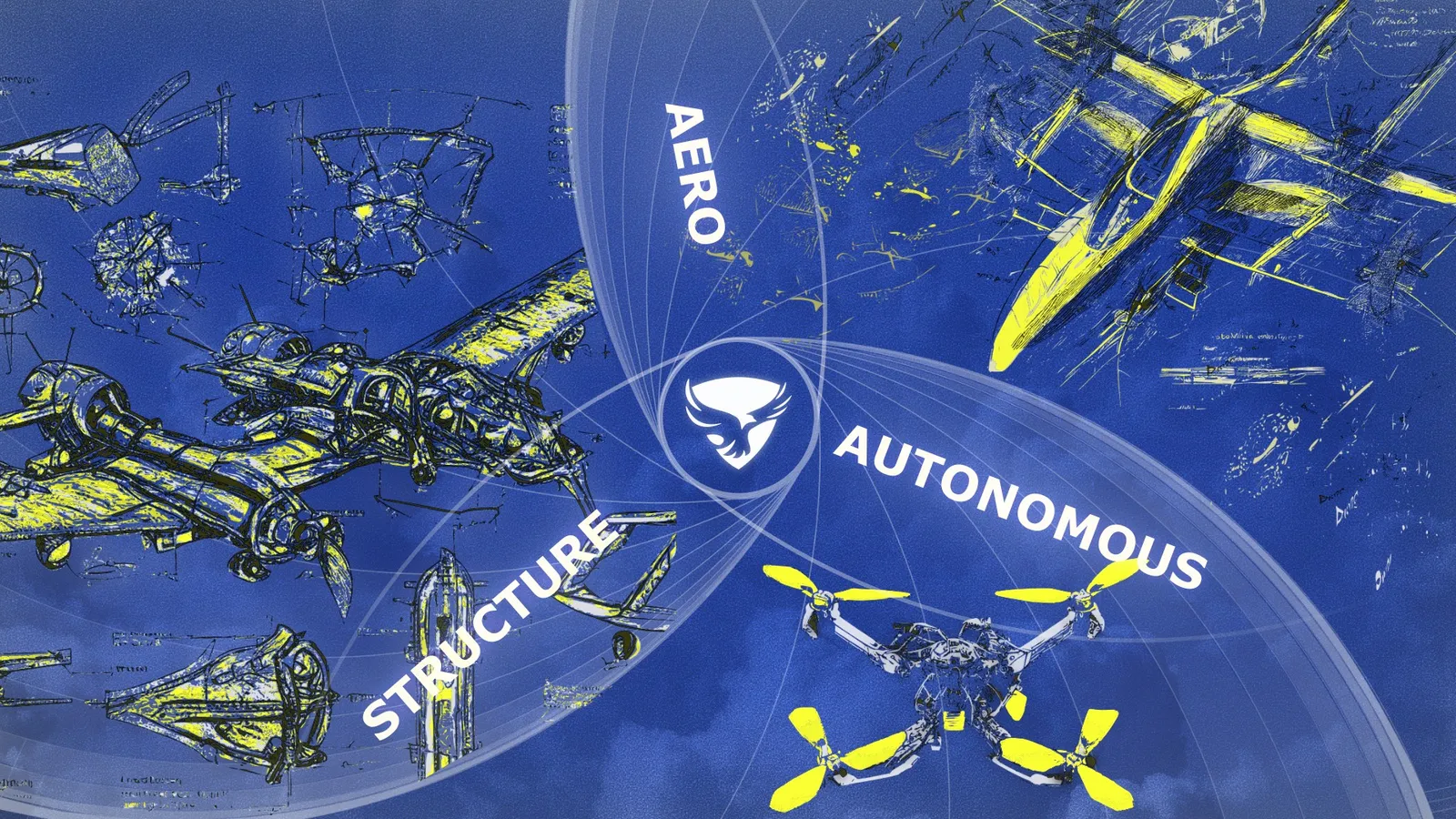
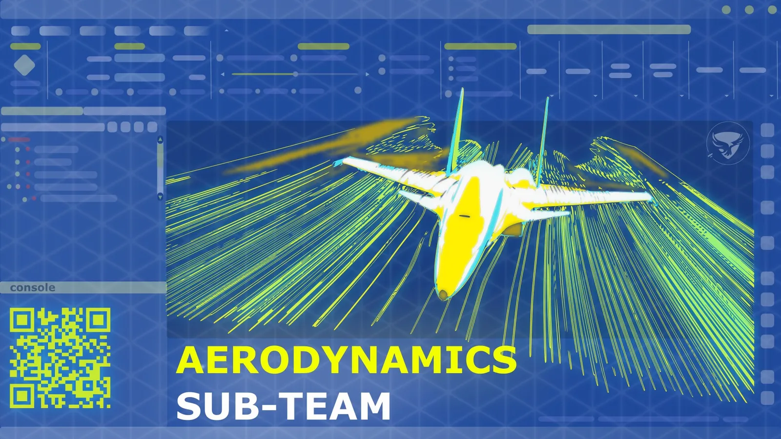
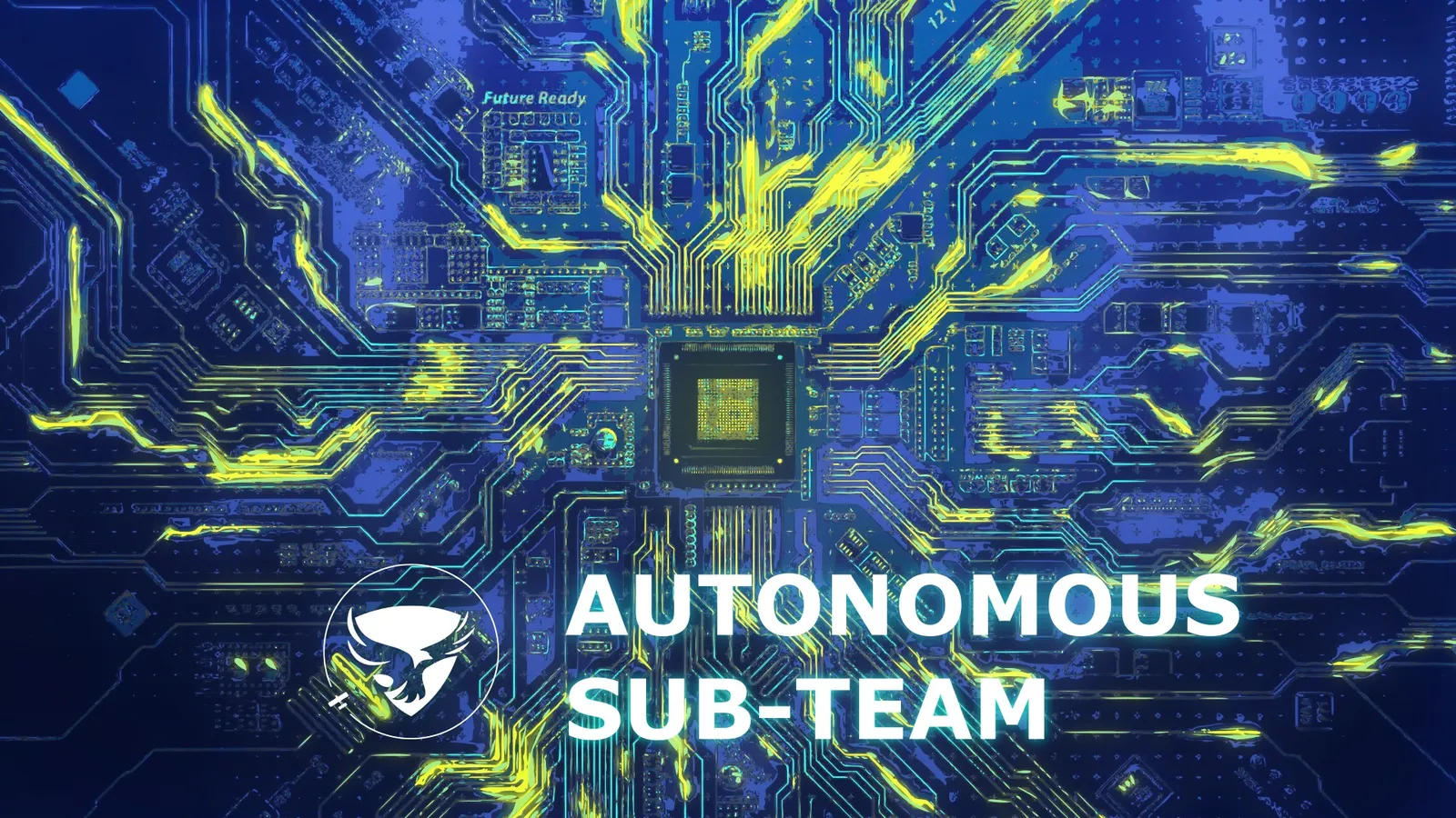
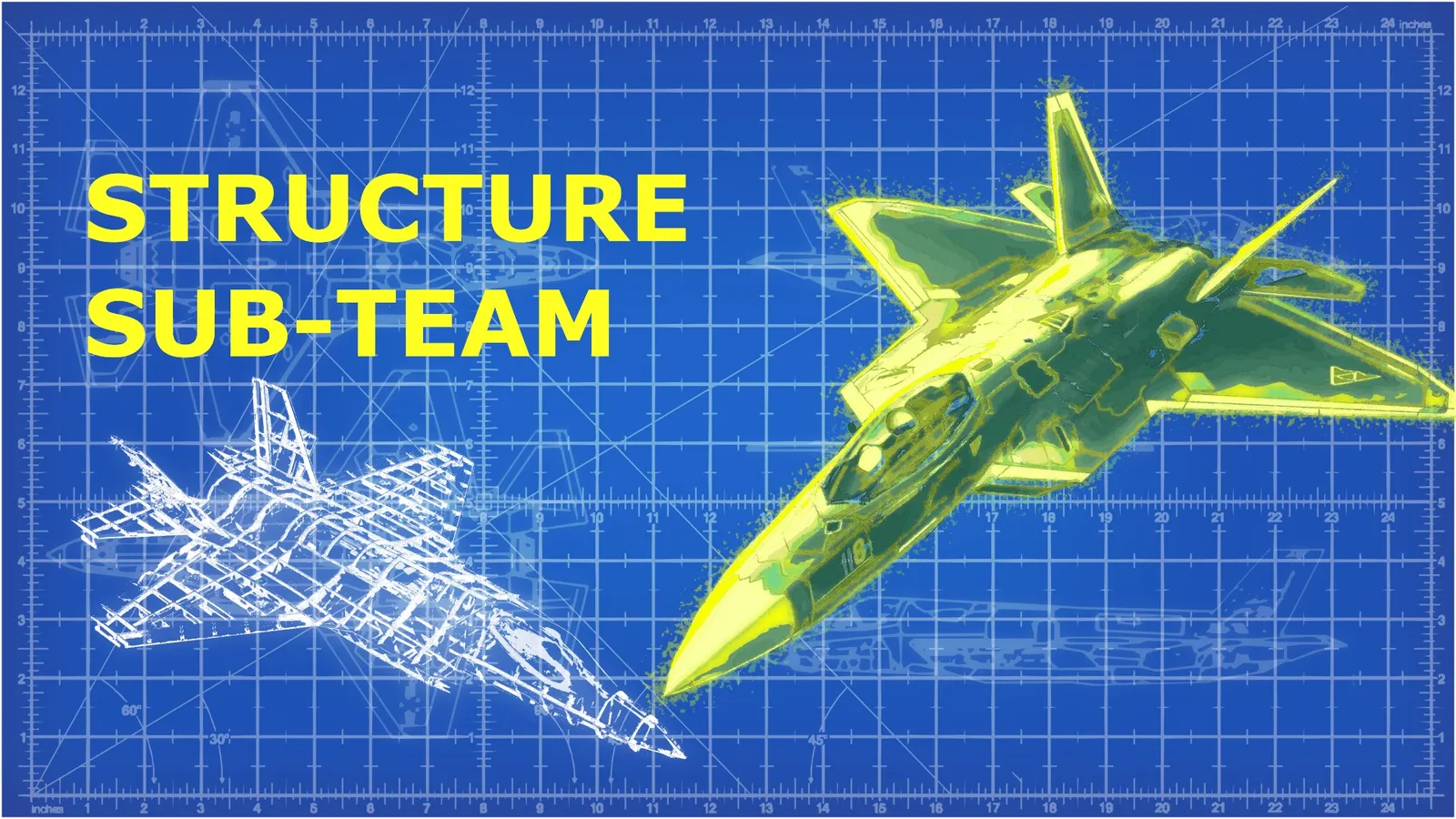
Each subteam received its own visual interpretation while staying inside the same campaign system. Structure was represented through blueprint grids, Aerodynamics through flow lines, and Autonomous through circuitry and signal paths.
Recruitment Updates #
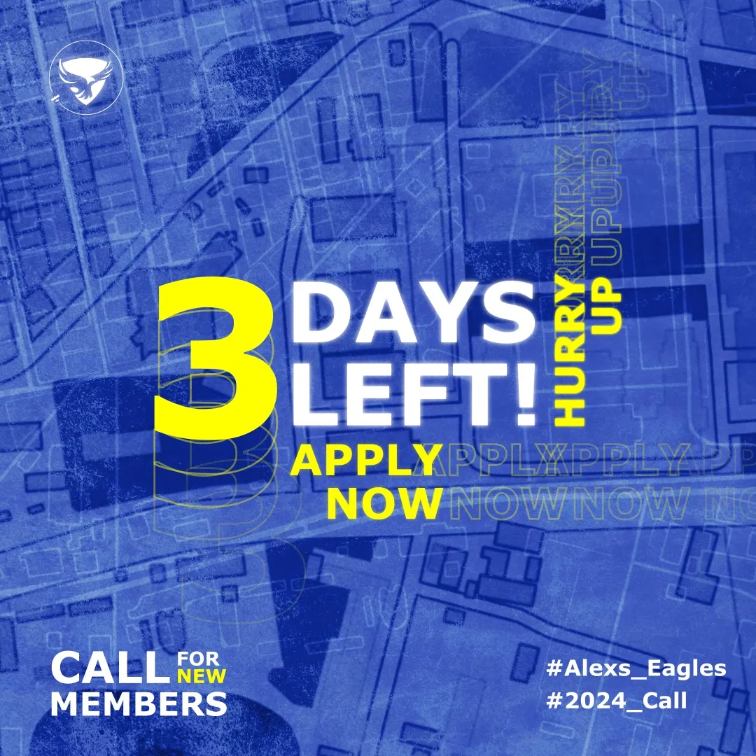
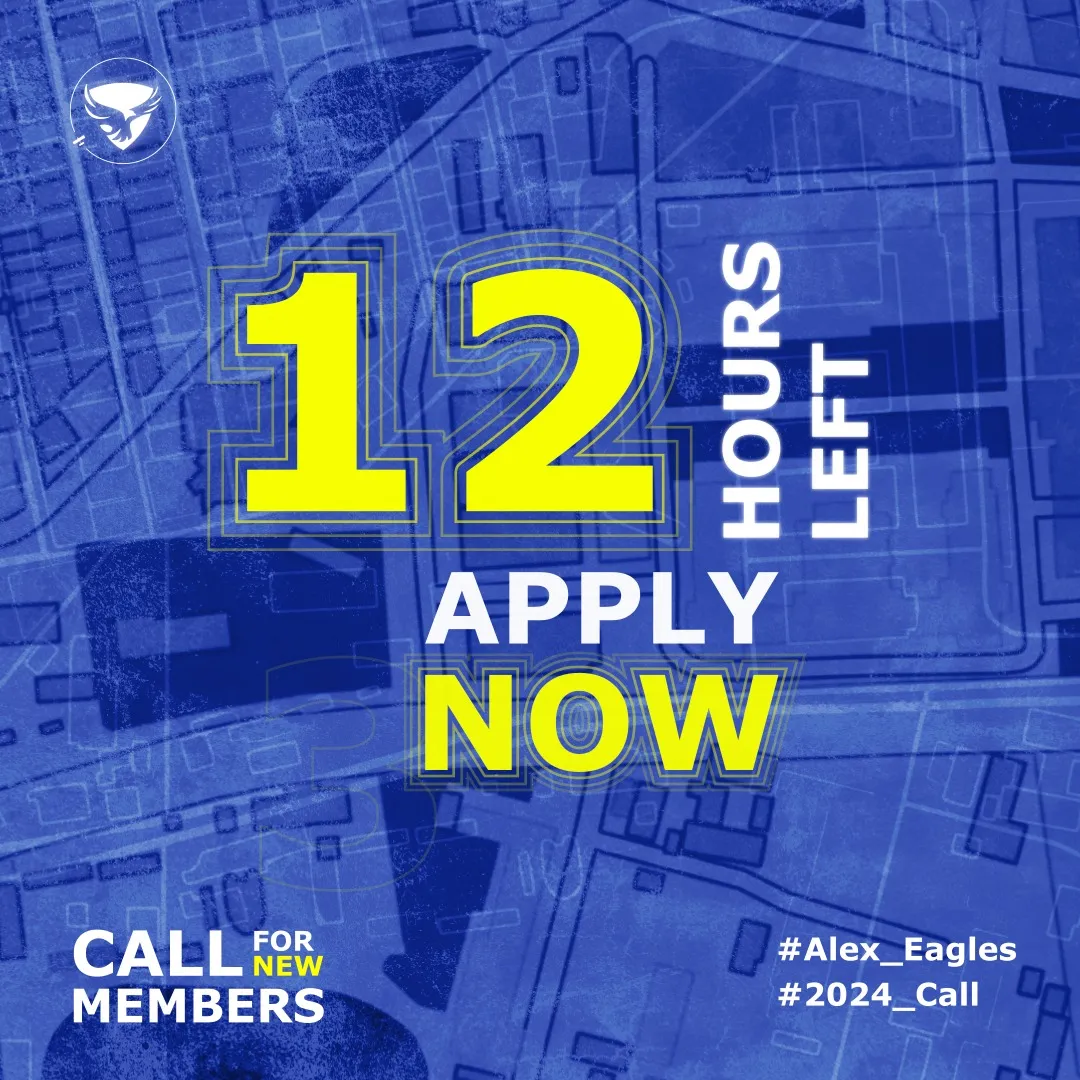
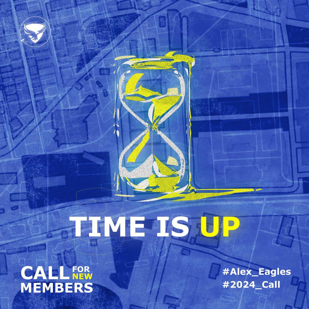
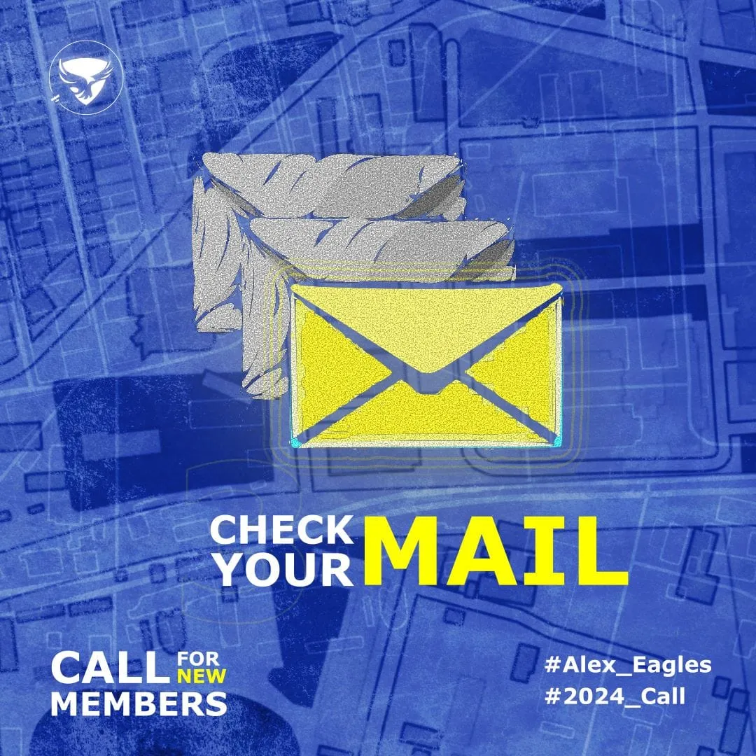
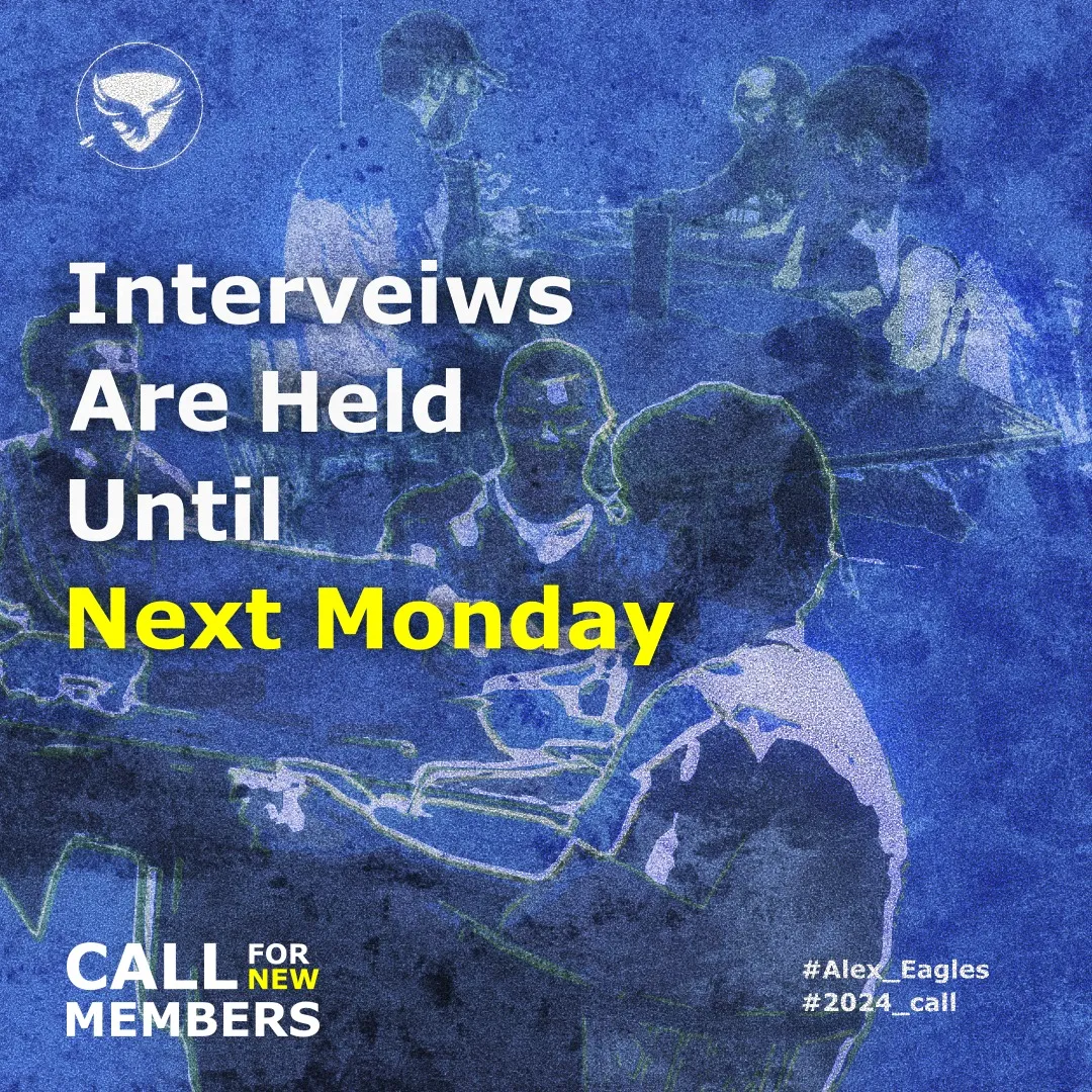
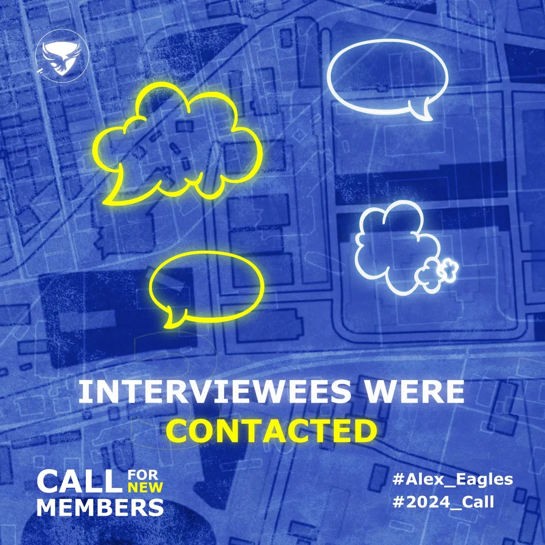
The campaign included a sequence of operational posts that followed the recruitment funnel — interviewee contact, interview scheduling, email reminders, countdown notices, and final deadline announcements — all designed using the same blue/yellow language.
Sponsors and Collaborations #
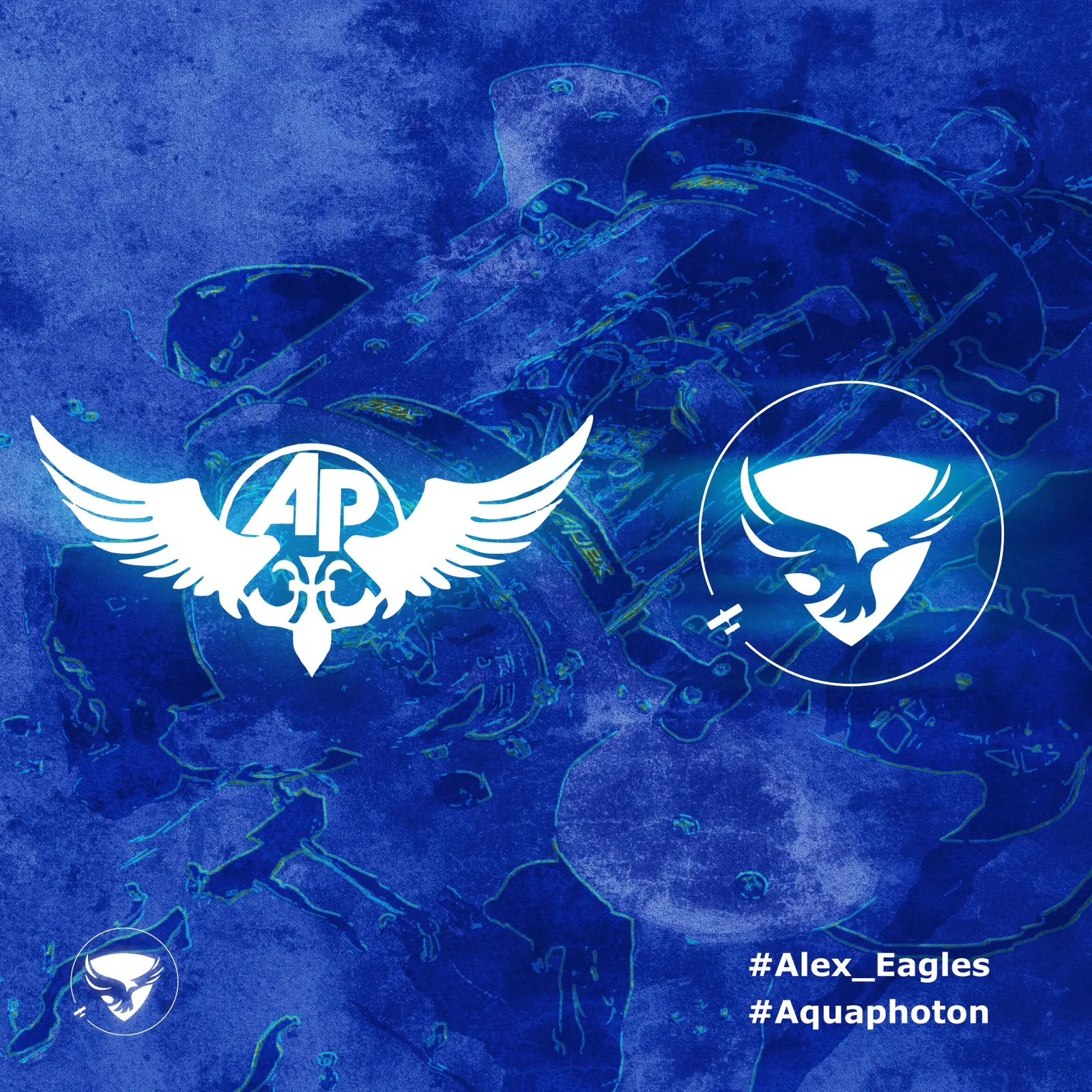
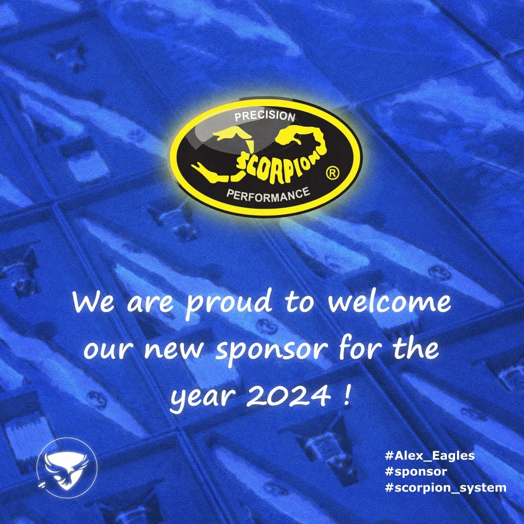
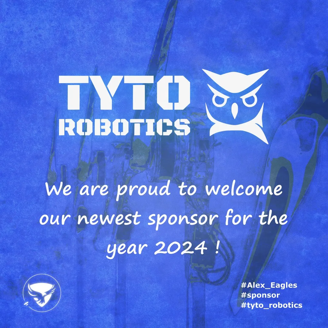
Sponsor and collaboration posts followed the same brand system but introduced a deliberate twist: imagery from each partner’s own social presence was converted into texture and integrated into the design.
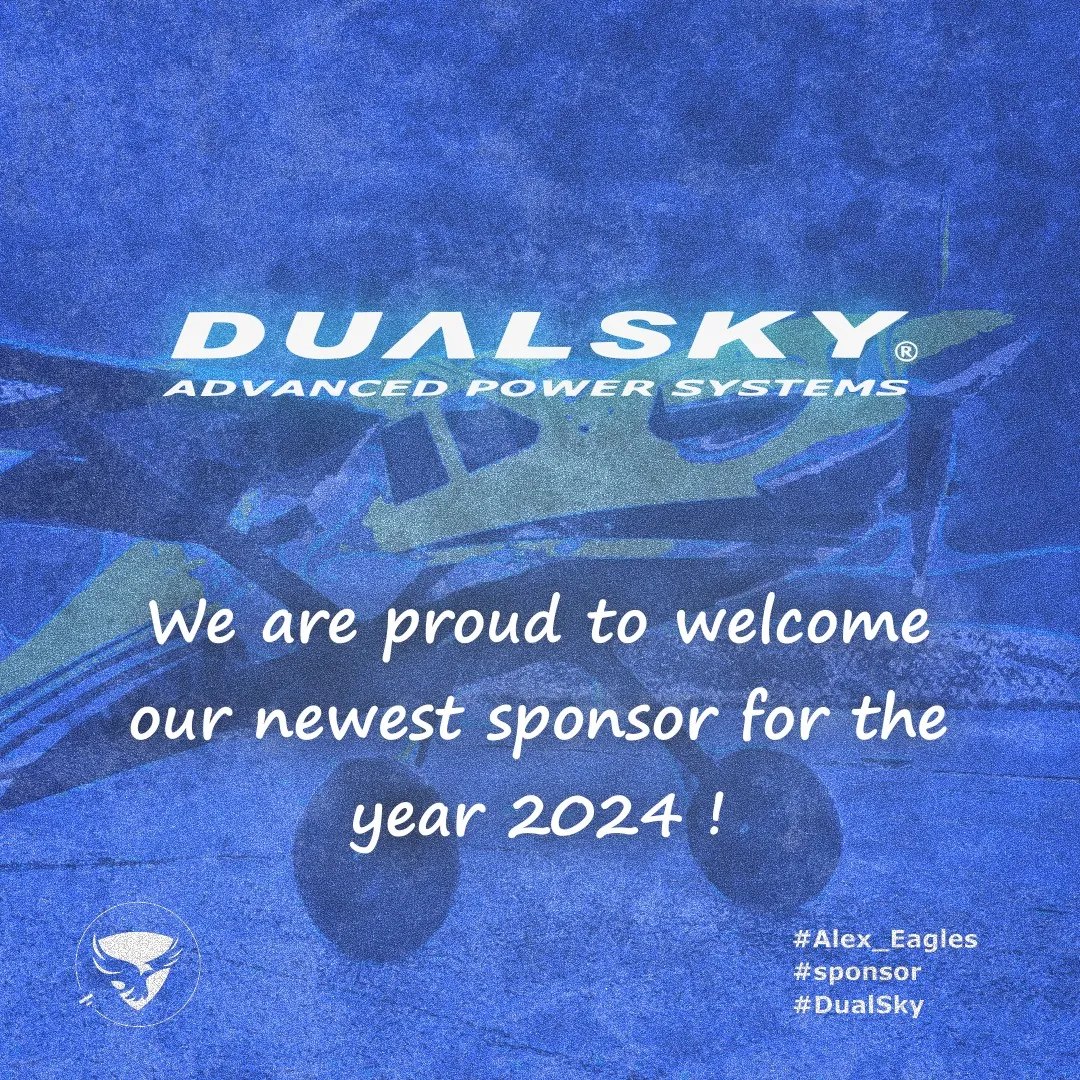
The logo was treated as a visual engine, not a fixed mark — every post reused the same radar geometry so the campaign stayed recognizable without repeating the same layout.
Design Philosophy #
Design should reflect structure, function, and meaning at the same time. Nothing in the system was arbitrary. The logo was treated as a visual engine rather than a fixed mark.
Outcome #
The campaign gave the team a recognizable and consistent presence across social media, despite the absence of an established identity before the project began. It demonstrated a systems-based approach to graphic design: each post served a clear function, but every element remained part of the same visual universe.